


Photography by Millissa Martin
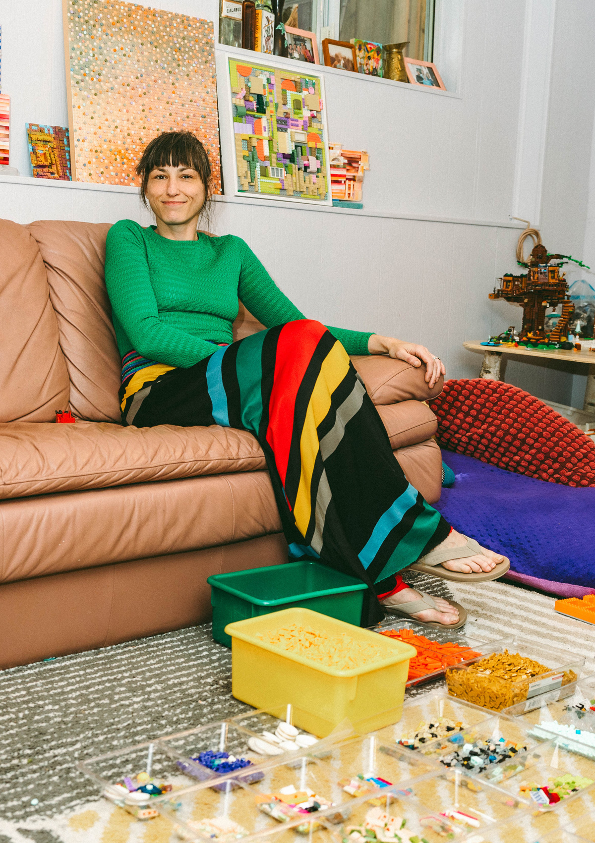
One day, Katherine Duclos’ son handed her four flat LEGO squares, stacked, in colors he’d chosen for her. “I thought you’d like the colors next to each other,” he said. It was a small gesture, but it rearranged everything for the Vancouver-based multimedia artist.
Katherine is autistic, as are both of her children, and building LEGO sets the conventional way had always defeated her. “He was very good at the sets, but I was not,” she says of her son. “I lack the ability to rotate images in my brain and struggle with spatial diagrams, so the instructions are very difficult for me. I have in fact never completed a LEGO set without help.” She built alongside him anyway, because for her family, parallel play — sharing the same space while doing entirely different things — is integral to how her children develop and regulate. Her son wanted her next to him. “Mama, will you build with me?” he’d ask. She needed a way to build with him on her own terms and actually enjoy it — because he could always tell when she was masking.
Those four squares gave her that. Instead of a product, she saw modular color, bits she could use like any other, without having to make “the thing” the instructions told her to. She could simply build what her eye wanted. And she hasn’t stopped since.
There's more! Continue reading this article by subscribing to BRICKA.
There's more! Continue reading this article by subscribing to BRICKA.
Color, Made Modular
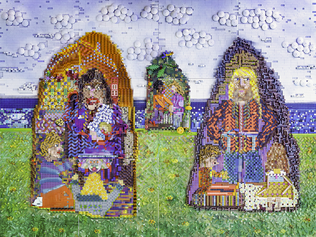
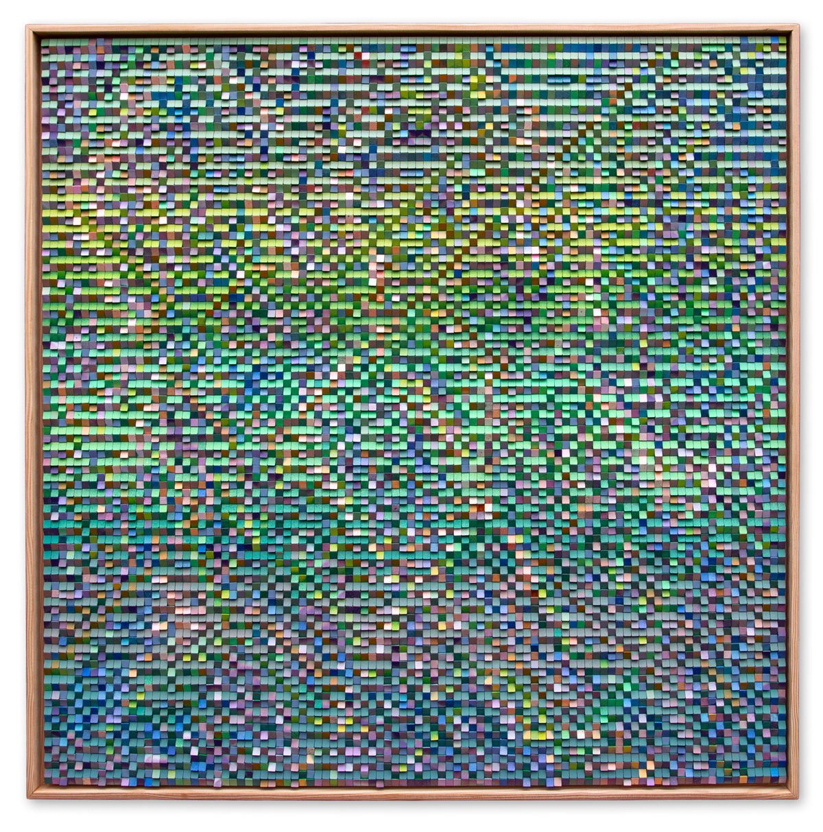
When color theory meets LEGO, the familiar tactile brick becomes something else: a medium for capturing movement and light. Principles that have shaped how artists work with color for centuries take a modern turn through the plastic brick. Katherine has been elevating LEGO to an artistic medium since 2021, creating wall tiles, small table sculptures for the fidgety adult, and intricate panels made from hundreds of smaller pieces. At first glance, her wall pieces evoke the fleeting light of Impressionism and Neo-Impressionism, or the bold shock of color-field work — modernized by her use of materials from popular culture.
Upon closer inspection, the unit of color is not a dot on a canvas but a smooth LEGO tile or a repurposed specialty piece used for greebling. Her first set of wall tiles features abstracted shapes she calls constructions, mounted on colored paper and framed. Light hits the constructions, color pulls or pushes the eye, and a combination of studs, flat tiles, and the occasional surprise piece creates a visual feast for art-goers and LEGO lovers alike. Within the tiles, a variety of shapes emerge — mono-colored pieces, translucent pieces, squiggles, scales, flowers — kaleidoscoping together into a plastic tapestry of Katherine’s vision. In one construction, colors from the pastel family merge into neon, neon calms into tan, then revs up again with pink and orange at the center, almost mimicking the grid of a park. The viewer’s gaze grazes over sharp gradations until, reaching the center, they realize Katherine has turned a square frame into a diamond.
What drives those choices is a powerful need. “My need for color harmony is my biggest color driver, not preference,” she says. “Harmony requires using colors I don’t even favor. It requires the muddy in-between transitional colors that help our eye move from one to the next.” That need is exactly where LEGO fails her. The sand family is her favorite palette, but the pieces are rare and expensive; Sand Red, she’ll tell you, was the best color the company ever made, and they retired it. “Those pieces can go for a few dollars each now. I used to hunt them, but now I just paint when I want that color.”
The Sketch, and the Paint
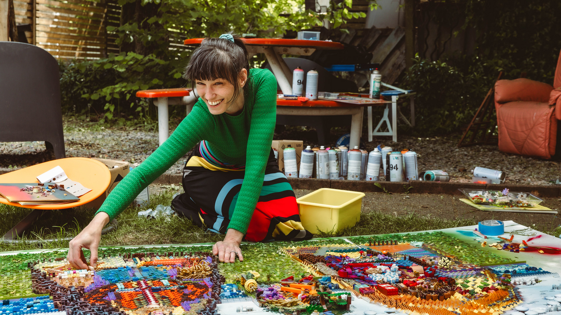
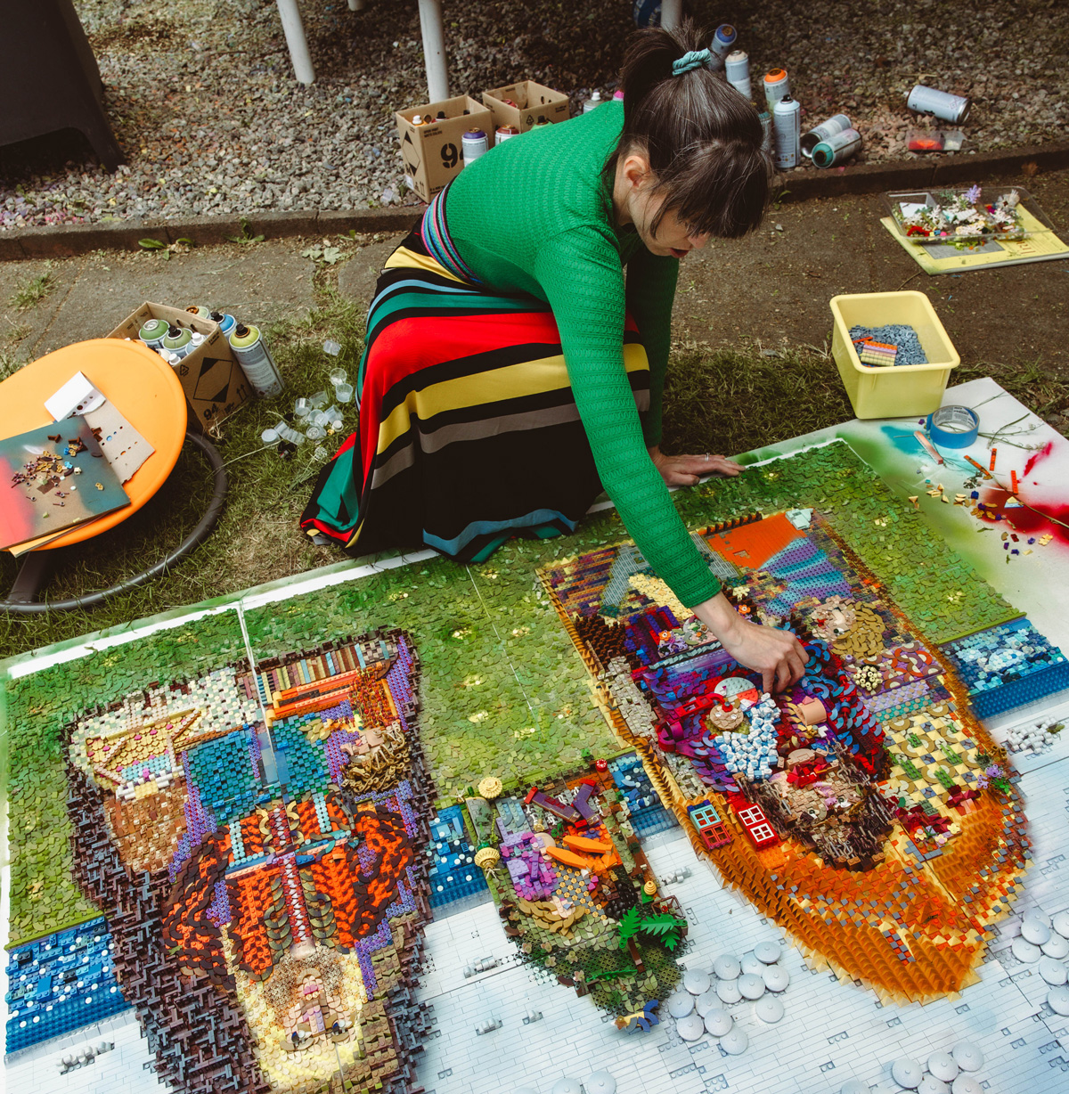
Katherine builds one piece at a time, starting by sorting by “color and type.” She lays down the initial blocks of color — what she calls “the sketch” — then decides which LEGO colors to keep and which to paint. The painting is the practical answer to a materials problem. “LEGO makes plenty of great colors — the problem is the availability and cost,” she says. “The way I am building now requires bulk amounts of each type of piece, so if I can’t get them at the cheapest price, which is at LEGO stores on the PAB wall, I opt to paint pieces to keep my prices lower. If I built with only pure bricks, my finished works would cost a lot more.”
Painting bricks is, in some corners, a heresy. Katherine has watched adult LEGO fans and even representatives from the company itself bristle at it. She’s unbothered, because the painting isn’t sacrilege — it’s how she reaches the transitional colors her eye requires. “Putting a low-value green between blue and yellow is an act of visual mercy,” she says, “because the contrast of the primaries is deeply unsettling for me.” She limits her primary colors and almost never uses them alone. “They are eye stoppers, creating points where we pause — and the goal for most of my pieces is continual eye movement. That’s why they bring peace to people even when they are incredibly colorful and complex, because there are no ‘sticking’ points for your eye to get stuck on.” None of it, she adds, is deliberate anymore. “When I choose my paint cans now, I barely pause to consider. It’s instinctual.”
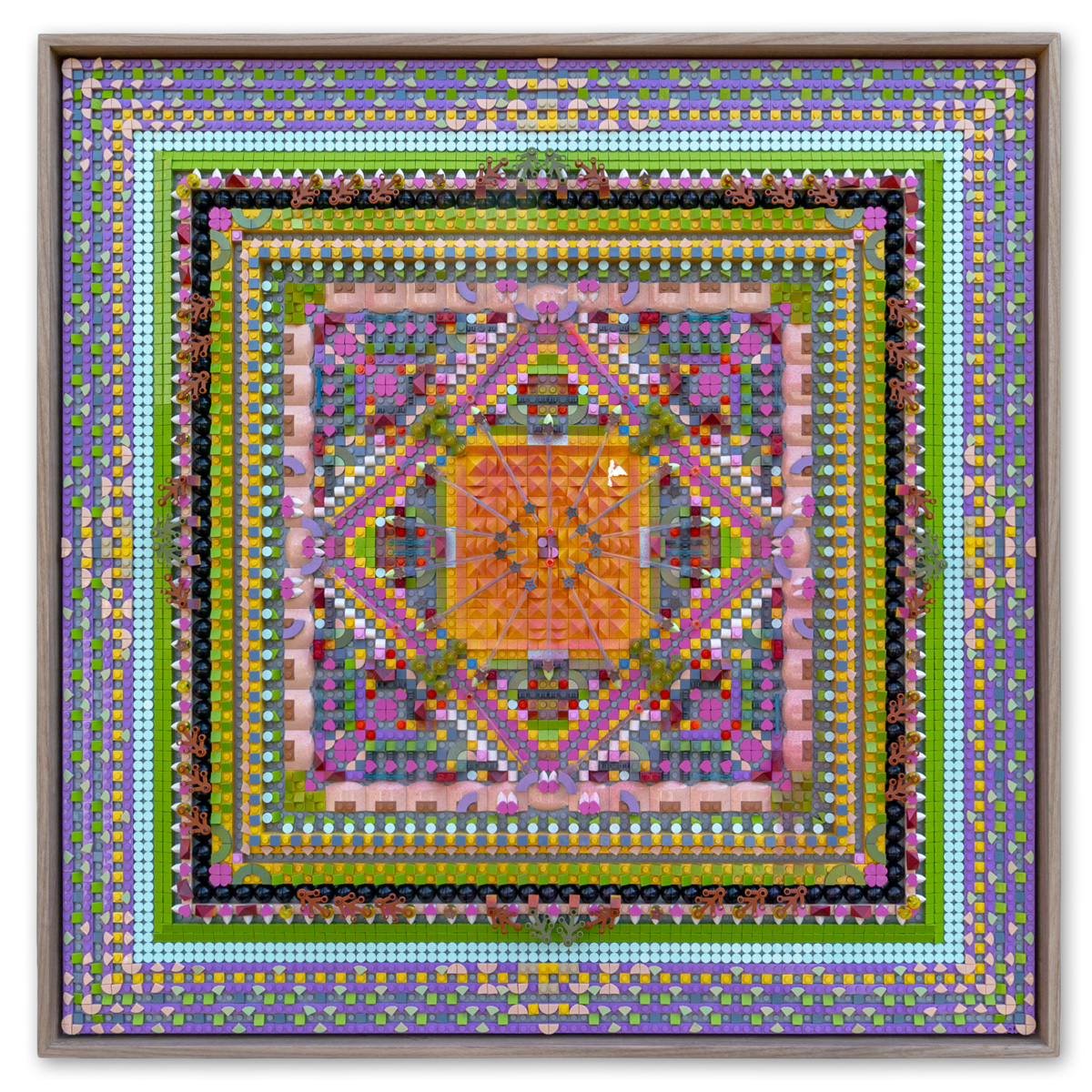
So much of her work is about the modular nature of color, which mirrors the modular nature of her material — how readily the human eye breaks a shape down into its basic micro-units, and how readily it rebuilds swathes of color and pattern in an instant. The visual impact of Katherine’s painted LEGO is both a jumper cable and a cooling salve to the optic nerve.
A Decade of Data
Growing up in Massachusetts, Katherine saw the world differently when she got her hands on materials, finding possibility outside their conventional use. Wooden tessellation blocks, for instance, had texture and color that looked different depending on what was placed next to them. She spent hours arranging them into large mosaics on the floor — arrangements her mother left undisturbed for days.
“When it comes to color, I was told in graduate school that I did not understand color and should stick to neutrals,” she says. “At the time, they may have been right. I did not understand how color worked, and the question of ‘What color is the light?’ — which is posed frequently in painting classes — confused me to no end.”
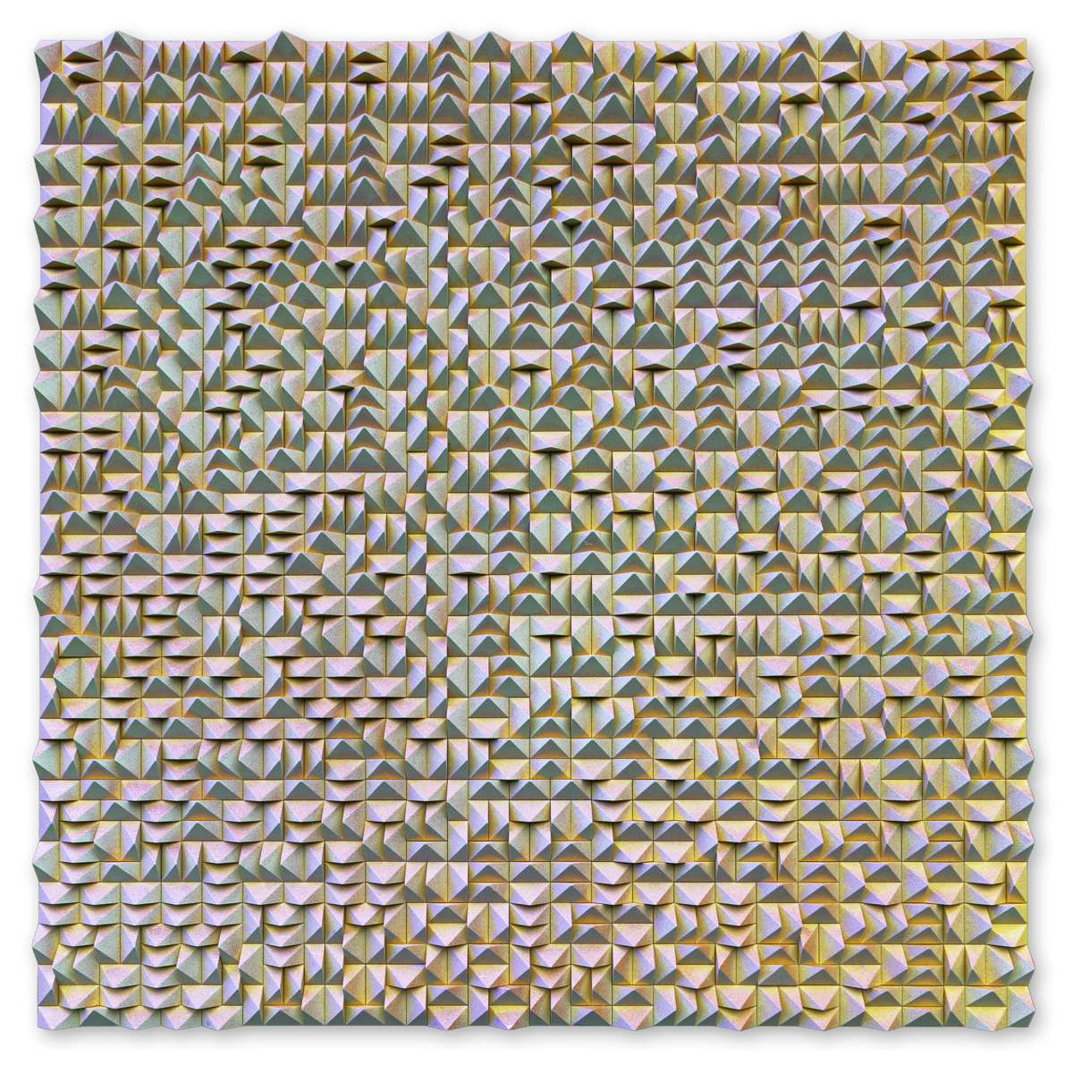
So she did stick to neutrals, for a decade, making paintings that looked like rocks on a plastic surface called Yupo. But in the background, something else was happening: she was taking thousands of photographs of her daily existence, and, she’s come to believe, her brain was quietly collecting data on color and light, trying to understand it. “I cannot envision things I have not seen before, and taking a photo helps my brain remember the moment. I have almost perfect recall for photos, but I cannot imagine things I’ve never seen. When I started working in color again in 2018, and when the LEGO began in 2021, my brain had a decade of color and light data to draw from.” The abstract compositions she builds now are sometimes near-replications of a photo she took five or ten years ago — though she often doesn’t realize it until the piece is built and she stumbles across the original image. In an artist talk, she once described her art as a subconscious visual expression of the data her brain has collected.
Before LEGO became a consistent material for her, Katherine’s work ranged widely — from photographed latte portraits to painted window screens of pastoral views. But the thread was always her identity as a neurodivergent mother and woman moving through the world. For a body of work titled Mother Hides, she burned expired breast milk onto canvases cut in the shape of animal hides, evoking the primal roots of motherhood, laid out in butterflied, inkblot shapes like the cave paintings at Lascaux. Some of the milk had been donated and kept frozen for six years before she transmuted it by canvas and fire. Many donors told her they simply didn’t want it to go to waste.
Autonomy Towers
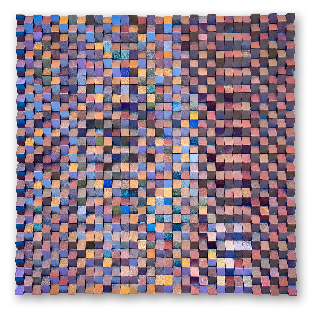
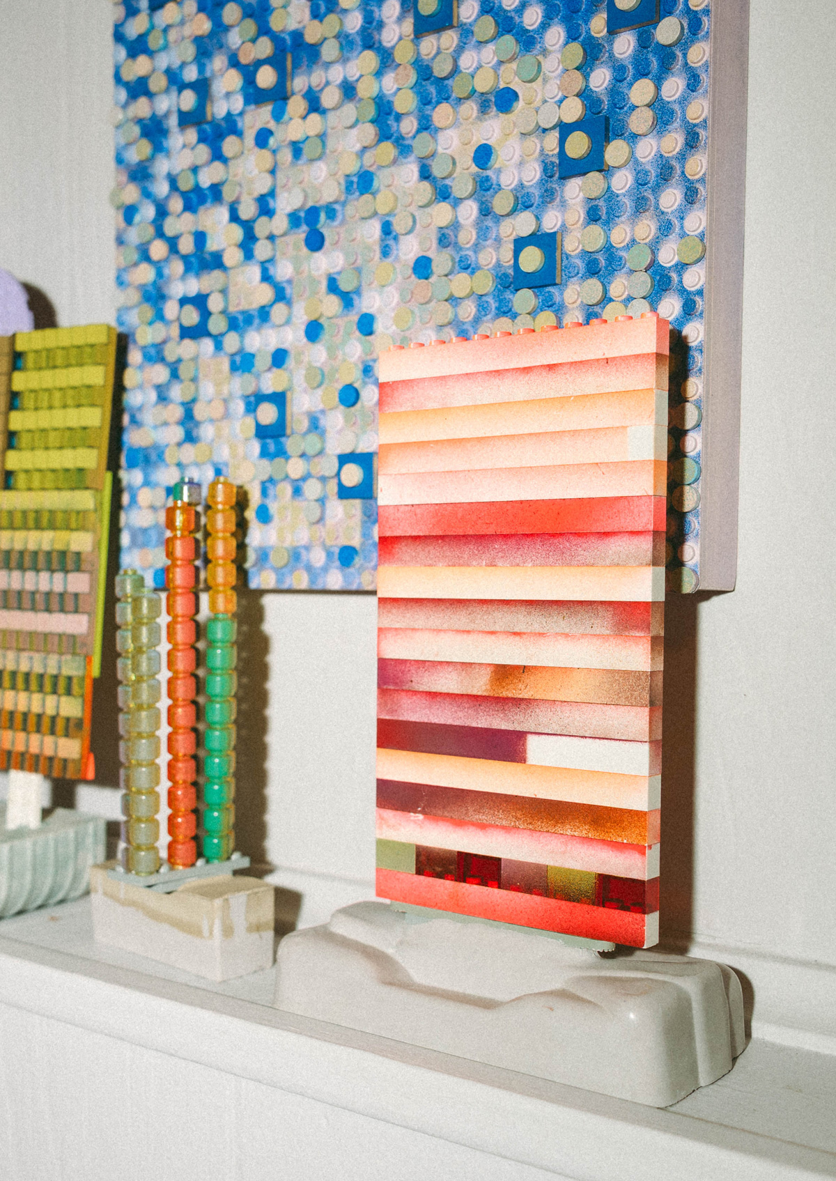
In her tabletop sculpture series Autonomy Towers, Katherine treats LEGO the way a sculptor uses clay or chicken wire. The medium subverts the viewer’s expectations, and the series highlights the architectural nature latent in any LEGO piece: long rows of bricks stacked vertically and mounted on a cement base, painted in ombré or in harmonious color. In this abstraction, LEGO can emulate a wall, a curtain, or something invisible — an emotion, even a memory.
The cement base is a bit of a trick. “They are meant to look like small sculptures for a shelf or desk,” she says, “but I call them Autonomy Towers because they are meant for the adult to use at work when they want to look like a serious person who collects art but actually needs regulation and opportunity to do things their own way during the day. They are playable, can be taken apart and rearranged, and then put back on the cement base. The base is what elevates them from toy to sculpture.”
That playability produces some memorable phone calls. Katherine recounts frantic patrons who’ve bought a sculpture and then dropped it on the ground — panicking, because the object is art, but made of LEGO. She tells them to take a breath and put the tower back together. To her, a “broken” Autonomy Tower loses nothing, and no value is lost if a collector reassembles it differently than she originally built it. The object simply refuses the art world’s assumptions about worth and permanence.
That refusal is a principle for her, not an accident. “I make a lot of sculptures using lots of materials, but the common theme is tactility,” she says. “I think sculpture should be touchable, because every single person wants to, except those who work to keep art inaccessible.” The barriers, she argues, protect capitalist and archival interests at the expense of the viewer’s experience. “I value the human experience above capitalism, and I think the Earth will go before all this plastic work will, so I am okay with people handling the work.” Her wall pieces are meant to be rearranged, too. “The nature of LEGO is modular, so I don’t like staking a claim to one expression being the only suitable arrangement.” The painted pieces scratch easily and can be damaged by excessive handling. She doesn’t mind. “For me, that just means the piece is alive.”
Where There Are Roots
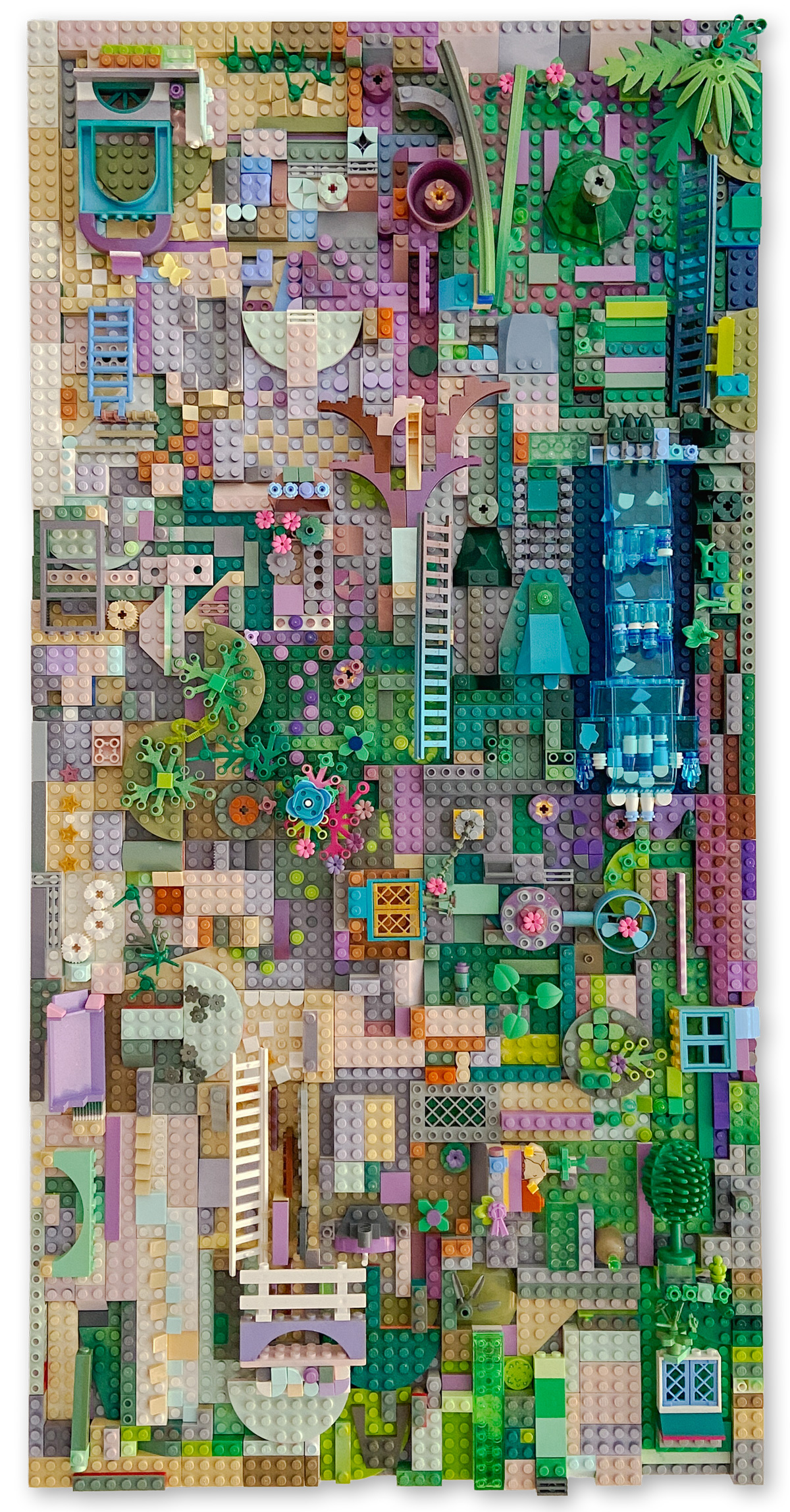
In 2023, as Katherine moved into larger-scale constructions, the LEGO Group found her work online and commissioned an original piece for the Center for Creative Flow installation at Art Basel during Miami Art Week. Where There Are Roots measures 30 x 120 inches and draws heavily on the new botanical sets, roughly $7,000 in materials. It presents a shifting landscape where urban and natural roots collide and interface — greebling galore, with spiderwebs as highlights, pirate wheels as signal towers, and car hoods as clouds. Swatches of pixelated color hug an architectural island that seems, on a closer look, to shift perspective from bird’s-eye to two-point. It’s structured, it’s organic, it’s alive.
The commission produced a moment Katherine still savors. “The LEGO Group executive who headed my collaboration told me I had come up with attachment techniques the brand was not aware of,” she says. “She said some higher-ups in Denmark thought the way I was using the product was actually novel, and it was very exciting to know I had done something the LEGO Group itself had not predicted for their product in all the years it has been around.”
That fresh perspective is exactly what she’d like to bring into classrooms. Katherine imagines lessons that use LEGO as a genuine educational material — a manipulative far beyond its current use — with the same reframing her son once handed her on a hard afternoon.
The Visible and the Invisible
At the heart of Katherine’s work is translation: the experience of a neurodivergent woman with ADHD, rendered into beams of light that happen to be made of LEGO. The landscapes and color fields carry a real energy, expressing visible versions of things that are otherwise invisible — which is, poetically, a fitting job for a medium you’re meant to touch.
Her latest show is in Ystad, Sweden, a group exhibition running through October. For it, she made a large piece of twelve 15-by-15-inch bases, each painted with part of an image. The bases arrived bare; the pieces arrived painted with the same image, and the public — including many local schoolchildren — matched piece to base like a giant relief mosaic. As each base filled, it moved from tabletop to wall, and the larger image slowly emerged. She sent cement bases, too, for free-form sculptures made from pieces she painted in advance.
It is, in one exhibition, everything her work insists on: modular color as the crux, hands welcome, and the finished image less important than the act of building it together. Nothing glued, nothing precious, nothing that can’t be taken apart and made again.